Monday, 1 December 2014

Another Winter Showreel...

I decided to update my showreel again recently. This was due to ILM offering a tour to 10 of our best students in the 3D and VFX strands out the 2nd and 3rd years.

I decided to pick my best animation's from the past year and put them together in a new showreel that would then be sent to our lecturers. They then selected the best students. Luckily I was one of the students picked!


Winter Showreel 2014 - James Saunders from James Saunders on Vimeo.

Just wanted to say thanks to Josh Thornhill for organising the tour and ILM London for allowing us to visit :)

Saturday, 29 November 2014

Animation Exercises - Winter Showreel

Well, the first submission for animation has past. I just about managed to get the renders done in time thank goodness. The animation's below are a collection of exercises that we we're assigned to do. They were given to us to help reinforce basic principles of animation as well as started to think about performance and story telling.

I thoroughly enjoyed doing them and I'm looking forward to the acting focused pieces we'll be covering over Christmas.


Animation Exercises Winter 2014 - James Saunders from James Saunders on Vimeo.

Thanks for all the help on 3Dhit too :)

Wednesday, 26 November 2014

Telephone Animation - Refining and Lighting


After some final critiques for the telephone animation I rendered it out for the submission today. The last major change I made to the animation was reducing the head movement after the second take on the phone. This allows the audience to focus more on the character's eye darts. I think it's clearer to the audience this way as it shows him processing the information that is being told to him through the phone.

Once the animation was finalised I started to work on the lighting and renders. To help with the lighting setup I looked at how live action films are traditionally lit and found some useful information:


Lighting

3 Types of Lighting used during 20th Century film making:


  • Classical - Hollywood system during the 1930's.
  • Baroque or Theatrical - Extreme lighting focused on emotions
  • Modern - 1960's onwards, using existing sources of lighting and then emphasisng them with more lights.

In truth film making today uses a mix of all the 3 above lighting methods


Due to the simple nature of my animation exercises I decided to emulate the classical lighting of 1930's Hollywood which focuses on lighting the actor and his face as best as possible.

The basic lighting setup for this system can be seen in the diagram below:


The key light's role is to duplicate the sun and provide the main source of light. It is generally 40 ° from the camera and angled down on the subject.

The fill light's role is to fill in the shadows created by the key light. It makes sure the shadows aren't too dark.

The back light's role is to separate the subject from the background. They tend to be above the subject to create a rim around the subject's outline. The background is usually lit separately.


Ratio of Key Light to Fill Light:

Generally the key light is three times as strong as the fill light but can vary greatly depending on the film and the emotion. i.e. Film noir generally has a ratio of 9:1

With all this in mind I began to set up my lights in Maya.


Lights in Maya

At Hertfordshire we're fortunate enough to have access to Arnold and the world's first Arnold renderfarm at an educational institute. So I used Arnold for my renders.

Firstly I created a curved background that acted as the floor and the wall. It's curved to get a nice gradient from the lights.

I then created 4 ai Area lights and set them up similar to the lighting diagram above. Notice the large light at the top to illuminate the background. (Also notice how I haven't really placed the key light correctly. It should be angled downwards more on the rig...)


I then played around with the exposures of the lights until I had the desired effect. Begin with the key light first and then light the rest. The result is below. Quite a nice looking render! All from simple area lights and a bit of Hollywood knowledge.


And the final rendered out sequence below:


Telephone Dialogue - Render from James Saunders on Vimeo.


I hope some of this information was useful. The next step is to play around and see what different moods can be achieved by messing with the strengths, colours and angles of the lights.

Saturday, 22 November 2014

Telephone Animation - Another Pass

I've taken onboard some more critiques from http://3dhit.co.uk/ and made some more changes to the animation. Mostly the facial animation and a slight camera move. Hopefully i'm getting closer to the finished piece now. Especially since the deadline is on Wednesday!!


Telephone - Refined from James Saunders on Vimeo.

Monday, 17 November 2014

Telephone Animation - Rough

This animation exercise required us to animate a character reacting to some unheard dialogue over the phone.

Whilst I haven't finished the animation below I thought it would be important to post up. I received some great feedback here on www.3dhit.co.uk and as a result I'm going to go back through and make some changes.


Telephone News - Rough from James Saunders on Vimeo.


Hopefully there will be some improvement by the next time I post!

Tuesday, 11 November 2014

Concept Art Designs


Below are some recent character designs and an environment design that I submitted for our recent concept art module. We had to take a character from the film "Jason and The Argonauts" and redesign them in whatever style and period we'd like.


Aeetes


Poseidon


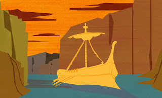
Environment Argo


Personal Character


I'm still rather a novice at painting in photoshop so I used this tutorial as reference on how to paint my character designs. Highly recommended: https://www.youtube.com/watch?v=_Evj8baC5-0


Sunday, 26 October 2014

Park Bench Exercise - Stepped Poses 01

As the term progresses we're our 3D animation classes are moving more towards the acting side of things which is nice. Our first larger exercise in this is the Park Bench Exercise.

The exercise must involve two characters interacting with each other whilst one of the characters is listening to headphones. We then invent a scenario and pose it all out in stepped mode until the story comes across.

Below is what i've managed to do so far. It could do with a couple more poses here and there but at the moment I think it works quite well.


Park Bench Exercise - Stepped poses 01 from James Saunders on Vimeo.

Critiques welcome as always :)

Saturday, 4 October 2014

Life Drawing Class - 01 Forceful Drawing

First class of year 2 begins with some life drawing tutored by Frank Victoria and Kevin Molloy. We are looking at the forces involved in a pose and learning how to see and illustrate those forces.

The session consisted of mostly 5-10 minute poses with a couple longer 20 minute poses towards the end.


Sunday, 21 September 2014

Squirrel Animation

Finally finished the first draft of my squirrel animation!


Squirrel Animation from James Saunders on Vimeo.


Overall i'm pretty happy with how it looks.

One of the hardest parts was trying to get the tail overlap looking believable with the jumps. It would very quickly turn unappealing and stiff. By dealing with the root of the tail first and then animating outwards I could get quite a nice effect quite quickly.

I highly recommend using the Squirrels Rig. It's free and super fun to use.

On to the next one!

Tuesday, 16 September 2014

Back to Basics - Squirrel Animation

I was halfway through another shot using the JACK rig from Animsquad when I felt like I was getting swamped with the technicalities of Maya and losing sight of the principles of animation.

So I've put that animation on hold for now and started work on a new project using the Squirrels rig from animation mentor:


Before I decided what to do I looked at some progress reels from Animation Mentor students. I wanted to see what type of animations they were doing to get the basics down. There were loads of really nice walk cycles, a few pantomime shots and a couple of bouncing ball exercises. I noticed how energetic and cartoony the animation was and thought it would be interesting to try and go for the same style. It would also be a nice change from the slightly more restrained animation I was doing with JACK. 

The 'ball with a tail' exercise felt like a good one to do as it encompassed most of the qualities I wanted to get better at such as fun timing, rhythm, squash and stretch and personality.

The idea I came up with was to have an acorn fall out of a tree and then have the squirrel chase after it. It's not quite finished yet but below are the progress of my arcs and timing of the animation:


 Rough sketch of the overall idea and arcs I wanted.


I then filmed video reference and animated some initial arcs. The reference was valuable to help get a sense of timing and rhythm to the squirrel jumping around the tree  (I pretended my fingers were the squirrel!).


 Refined arcs and timing. I removed some the of the jumps as it all felt a bit too frenetic.


Final arcs and timing of the shot. Quite a bit of difference from when I started.


Should be a few more days until the first draft of the animation is done :)
In the meantime here is some animation of Scrat from Ice Age that I took inspiration from: 


Tuesday, 9 September 2014

Quick Life Drawing Sketches

Just a couple quick life drawing done over 5 - 10 minutes. Trying to keep up the practice!


Friday, 5 September 2014

Film Sketching - E.T.

I saw a blog post this morning on cartoonbrew about the value in sketching out a film sequence or even an entire film. (Check here for the original post: http://storyshots.tumblr.com)

It totally makes sense to do this as it forces you to notice all the different elements of visual storytelling. Below are some examples I sketched out the opening scene for E.T. and I've already learnt a ton. I didn't focus so much on detail as they are more like notes to myself than presentable drawings. I'm definitely going to do more of this when I have a spare moment.


Friday, 29 August 2014

Breaking Down the Breakdown

Recently I felt like I was struggling with some of my animation. Specifically, the best way to approach the breakdown pose. So, I took a step back from what I was doing and went to study the basics of timing charts and breakdowns.

My Breakdown Workflow


First of all it's helpful to define what a 'Breakdown' actually is. The simplest definition that I can give is:


"A Breakdown is an initial position between two keys. It defines how a character moves from one pose to another"


Eric Goldberg:
"Key poses are what the character is doing, then the breakdowns are how the character does it"


Keep in mind the performance


I think the most important thing is to keep in mind is what you want the final action to look like. By doing this it helps inform all the other variables that are decided in the breakdown. 

Where does the breakdown go?


Refer to the timing and spacing on your chart for the action (if you used one) for a rough guide on what eases in and out for the action.

Does the action snap out of the initial pose? Does it ease in the final position?

For example, if you want the action to snap out of the first pose and ease into the second, the breakdown will probably be placed nearer to the second pose. 


However, The breakdown pose is not always a dead in the middle inbetween!

By adjusting the breakdown pose we can create automatic overlap, drag and arcs. And most importantly for a character we can add personality to the movement. You can actually achieve two entirely different performances from the same key poses and timing by making the breakdowns different. 

See the example below taken from Eric Goldberg's book "Character Animation Crash Course":


In the examples we have a dog looking in one direction and then turning his head to look in another direction. (Note how the timing chart indicates the ease in and out between the key poses. The ease in to the second pose is slightly longer.)


This example above shows a very stiff, mechanical breakdown. Something we often see the computer give us in CG animation.


In this example we have adjusted the breakdown to give us much looser and livelier movement between the two poses. Also note how the breakdown favours the first key.


In this last example the action is really polished up by adjusting inbetween 9 also. It follows the flow of the breakdown at 7.


To Recap:

1. Keep in mind the performance you want to give.

 2. Decide what eases in/ eases out during the action.

    3. Decide what frame the breakdown should occur on.

    4. Adjust the breakdown pose to create, drag, overlap and interest in general

5. Play and adjust! It will hardly ever be right first go so play about a bit and adjust accordingly. However, it is easy to get confused because of all the variables in a breakdown so try and understand what you want to do before changing it.


Have a look at Eric Goldberg's book "Character Animation Crash Course" for more info. Highly recommended.


Friday, 22 August 2014

Round 3 - Waiting for the Bus

After a round of critiques on 3dhit.co.uk I have hopefully corrected some of the problems that were in my animation.

One of the main points from Liam Reynolds (website: http://www.liamreynolds.co.uk/) was that it looked very pose to pose, there wasn't much secondary action between them. He's right and looking back at it you can see where the whole thing goes kind of dead between poses. To fix this I've put in some torso movements and some more accurate weight shifts.

Tom Barber (website: http://www.tom-barber-3d.co.uk/) also suggested that I have a look over my spline editor to check out what my curves were doing. And yep, the some of the splines had some weird hitches and bumps in them which i smoothed out to create some clearer anticipations and overlap.

Big thanks to those two for the help :)

I feel ready to move on to a new shot now as it's been a few weeks on this one. I'd like to do another pantomime shot to try and nail down the process and workflow. (One thing for sure is to add some more detail during the blocking stage so I don't get as lost when I go into spline mode.)


Waiting at Bus Stop - Spline part two from James Saunders on Vimeo.

Tuesday, 19 August 2014

Life Drawing

I thought I should try and get back into some life drawing to sharpen up the old draftmanship skills. Countless numbers of animators always stress the importance of good life drawing when it comes to the animation industry, so all the more reason to practice. There's a great article on Disney life drawing here: Disney Life Drawing Classes

I'm a big fan of the Andrew Loomis books for anatomy study. It's one of my go to books and it's completely free online as a pdf.

Below are some of the drawings I've done over the past week. They're not great but I'm hoping that by posting some drawings every now and then I can see where I'm going wrong and where I need to improve.

I've been using images online for reference which I know isn't great but It's the best I can do for now. One site I used fairly often is: http://artists.pixelovely.com/ 

I think my drawings averaged between 5 and 15 minutes in length.


Lastly, check out this amazing panel interview from Comic Con 2014: https://www.youtube.com/watch?v=M2Os2pMc-yU The life drawing tutors at Disney talk about the value of drawing skills in the animation industry. Worth a watch!

Saturday, 16 August 2014

2D Animation - Life of a shot

I've always wanted to do a classical 2D animation from start to finish. Since I have a couple of months before Uni starts again I thought this would be the perfect time to do it. Unlike computer animation, you get nothing for free in 2D, everything is created by the artist. Scary. I think it's really going to test my skills as an animator and hopefully it won't turn out a mess!

Over the next couple of weeks i'll be posting the progress of the shot from start to finish. So here we go...

Step One: Pick an idea

This is probably the most important step. There's no point spending lots of time animating a rubbish idea that hasn't been thought through. It's also easy to rush to the animation stage but usually the more planning you do, the better the end result will be.

So, I wanted to pick a simple idea that shows a change in emotion of a character. Whilst trying to come up with a scenario I held in mind a statement from Ed Hooks, an acting coach that specialises in teaching animators. He states that a good scene is one that shows, "Action in pursuit of an objective whilst overcoming an obstacle". I think this is true because it is simply more interesting for the audience to watch, there is a point to what they are watching. 

(Check out Ed Hooks below and if you ever get the chance to take one of his workshops, you should because I learnt a ton! http://www.edhooks.com/ )

I spent most of the day thinking up some scenarios and came up with the one below:

The idea:

An old man is finishing off a painting for a gallery showing. He adds the final strokes and stands back to admire what he has accomplished. As he basks in his own brilliance the painting falls off the wall and smashes. He throws his paint brush on the ground and storms off.

Step Two: Character Designs

The next step is to create a character design for the old man. I had in mind some personality traits to help me design him, (I imagined he would be quite eccentric for example). I also tried to keep the design relatively simple and easy to animate. Below are my different sketches exploring and refining the look of the old man. This is something i'm not very good at but I'm keen to improve!

Initial exploration sketches

Head designs

Head and body designs

Beginning to refine the character here

Final character design (i think...) on the left. Some slight variations of the head on the right.

After these sketches I noticed how contrasting shapes, sizes and lines can really add interest to a design.

Anyway, that's all for now, the next step is to film some video reference, work out all the key poses and plan the timing on a good old fashioned x-sheet!

Tuesday, 12 August 2014

JAWS - A Brief Analysis


After re-watching JAWS a couple of nights ago I decided to go back over it and analyse some of the scenes which I thought were interesting.


Chief Brody Introduction:

Charcoal and pen rough storyboard

I really like the way Chief Brody is introduced into the film. The transition from night time to daytime is very simple but it works brilliantly in slowing down the pace of the film from shark attack scene. The shot is then held as Brody is heard waking up and rises into frame. The editing takes us right inside his house without ever moving the camera away from the sea, simple and effective. The next shot then establishes that Chief Brody is in his bedroom with his wife. Note how his head is still framed within the window, it makes it clear which person we should be looking at and also provides some continuity for the audience to follow.


Finding The Body at The Beach:

This scene shows Chief Brody and the teenager finding the girl's body at the beach. I particularly like this scene for several reasons. 

At the start of the scene the weather is very pleasant like a typical summers day. The sea too is calm and the horizon remains low and harmless. However, once they come across the body the weather begins to turn grey and windy. The sea then takes up a lot more of the frame and as a result feels ominous and threatening. The final shot shows a nervous Brody in front of the sea which dominates the frame, it almost looks like the sea is going to drown him. It also implies Chief Brody's fear of the sea.

Spielberg also builds tension and anticipation into the scene by deliberately focusing on the reactions of the characters to the girl's body. Only afterwards does the audience then see what they can. In this case however, all the audience can see is a hand in the sand. It is left to the imagination to fill in. This is ultimately more effective than revealing everything as the imagination can often conjure up much more terrifying images than what could be seen on screen. These tricks are used frequently in Spielberg's films. Think of Jurassic Park when we see the reactions of everyone on the Jeep tour first before seeing the dinosaurs for the first time.


Charcoal and pen rough storyboard

Lastly, I really like the 5th image in the sequence above from a visual storytelling point of view. There is the distressed officer in the foreground and the other two behind the fence in the background. The jagged diagonal fence feels very threatening as it points towards the two. Would it be too far to suggest that they look as if they are inside the jaws of a mouth? Again the sea behind them is swallowing the frame ominously too.

Ferry Confrontation


This scene is a good example of visual storytelling too. It shows the mayor undermining Brody's power as a Police Chief by insisting that the beaches remain open. This is emphasised on screen by keeping Brody to the extreme left of the screen whilst the Mayor and his men crowd around him. Simple but very effective.


Clever Editing with the Environment


I love this sequence of Brody trying to keep an eye on what is happening in the sea, the edits match his increased nervousness perfectly. As Brody stares at the sea, passers by provide these natural wipes to switch views and as he becomes more anxious, the wipes become more frequent and zoom in on Brody to build tension. By utilising the environment Spielberg has created a much more interesting sequence than if it were normal cuts between views. 


Lastly, I noticed that before every death in the film we are told a little bit of information about each person. It isn't not much, usually we overhear a conversation or a name but by doing so the audience become more invested in the character and therefore care more when they die. I think this is something that is often ignored in many films and almost impossible in big budget superhero films (think of all the innocent bystanders!).


Wow, that turned out a bit longer than I expected. Anyway, if you haven't seen JAWS you should just go out, buy the DVD and watch it. It is a superb example of storytelling, film making and editing.


Sunday, 10 August 2014

Waiting for The Bus - Spline

After critiquing I re-blocked parts of the shot to adjust the poses and timing. From here I hit spline and tried to polish up the shot.

This has been my first go at animating a full on rig like this in such a complicated shot. I feel like there is plenty of room for improvement but hey, I wasn't expecting a masterpiece.

To begin I broke down the whole shot into individual acting beats. I would then focus on animating one beat at a time until it looked acceptable and then move onto the next beat and animate it. For example, one beat might be the character checking his watch (frames 30-46). Doing this made it less complicated when dealing with all the keys and the graph editor. I would also begin by focusing only on how the torso moves by hiding the arms and head. Once it was moving nicely I would then focus on the head, or the overlap of the arms. This way you don't get distracted by weirdly moving limbs whilst focusing on a different part of the body.

The hard part is obviously trying to apply some of the principles of animation to make it look appealing. It took a lot of tumbling around the rig and scrubbing through the motion to figure out some of the body mechanics. Frustrating but hugely satisfying when the character starts to behave the way you want it to.

Overall I think the shot is okay, there definitely needs to be some improvement but I am also looking forward to starting another shot soon.


Waiting for The Bus - Spline from James Saunders on Vimeo.

When I block out my next shot I will add a lot more information before moving to spline. In this shot I only really blocked the key poses and some extremes. It left me with a lot to neaten up once I was in spline mode. By adding some more breakdowns and anticipation it should hopefully give me more of a solid framework to build off once I go into spline mode.

Make sure to read this hugely helpul hint on 11 Second Club about "Moving past the fear of blocking"

Thursday, 7 August 2014

Random Pen Sketches during "The Thin Blue Line"


Sometimes whilst watching a film or TV I like to try and sketch some of the characters. It's good practice to sharpen you're observation skills and really focus on the defining characteristics of a face or gesture.

I sketched a lot of faces whilst watching "The Thin Blue Line", an interesting documentary film revolving around two men and the murder of a police officer in Dallas, 1976. It calls into question the integrity of the police and the courts of how the case was handled.


The film was also featured recently in BFI's list of The Greatest Documentaries of All Time:


The film consisted mostly of interviews so I focused on the faces of the people I saw. I like to try and use as few lines as possible when sketching.


And a couple more random sketches below :)


Also here's a great video by AnimSchool that really helped me with drawing faces:

https://www.youtube.com/watch?v=UZXw05lBaIg&list=UUPYQOUnJ3G1-QVUtZg62JNQ


Worth a watch!